From the lab
5 UX Feedback Surveys We Build with Survey Ninja

Analytics can show where people leave. A focused feedback survey can explain what happened just before they did.
At UX Feedback Lab, we use Survey Ninja to place short, context-aware questions around important website and product moments. The goal is not to ask visitors to rate everything. It is to learn one useful thing while the experience is still fresh: what they came for, what felt unclear, or what prevented a next step.
Below are five survey formats we build most often. Each is tied to a specific decision, so the answers can become an improvement queue—not just a collection of comments.
1. Website clarity survey
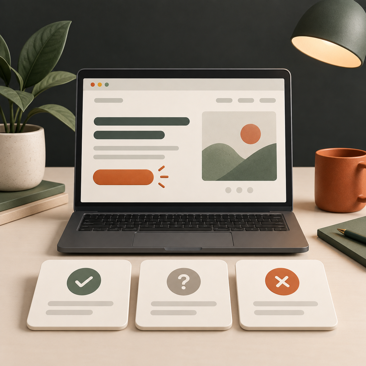
When to launch it
Launch this on a key landing page or service page after a visitor has had enough time to scan the main message—usually 20 to 45 seconds, or after they scroll past the first section. It is especially valuable before changing positioning, rewriting a homepage, or investing in a redesign.
Questions to ask
- What do you think this business helps people with?
- What would you expect to happen if you continued from this page?
- Was anything unclear or hard to find?
- How confident do you feel about what this service offers?
What to do with the answers
Compare a visitor’s description of the offer with the language your team intended. If people repeatedly name the wrong audience, outcome, or next step, start with the headline, supporting copy, navigation labels, and first call to action. Group open comments into themes such as “unclear scope,” “missing proof,” or “cannot find pricing.” Fix the most repeated, high-impact theme first, then rerun the same survey to check whether clarity improved.
2. Exit-intent survey
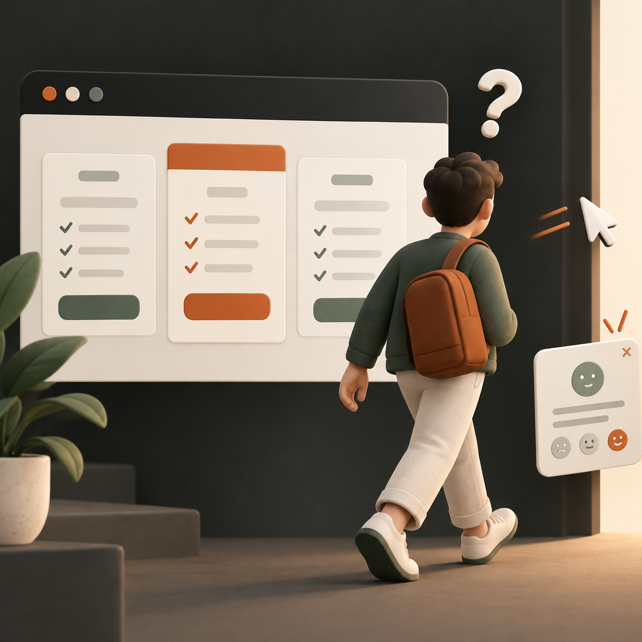
When to launch it
Trigger this only when a visitor shows a genuine sign of leaving a high-intent page: a pricing page, quote page, checkout, booking flow, or plan-comparison page. Keep it to one question at first. The purpose is to learn why someone did not continue, not to rescue every exit with a pop-up.
Questions to ask
- What stopped you from taking the next step today?
- Did you find the information you needed to decide?
- Which best describes the reason you are leaving? (I am still comparing / the price is unclear / I need more information / this is not the right fit / other.)
- What information would have made this page more useful?
What to do with the answers
Separate reasons that the page can solve from reasons it cannot. “Need to compare internally” may suggest a shareable summary; “price is unclear” points to better estimate expectations; “not sure what is included” calls for scope explanation. Do not treat all exits as a copy problem. Look for the point where the answer connects to an actual page element, then test a focused change.
3. Post-purchase survey
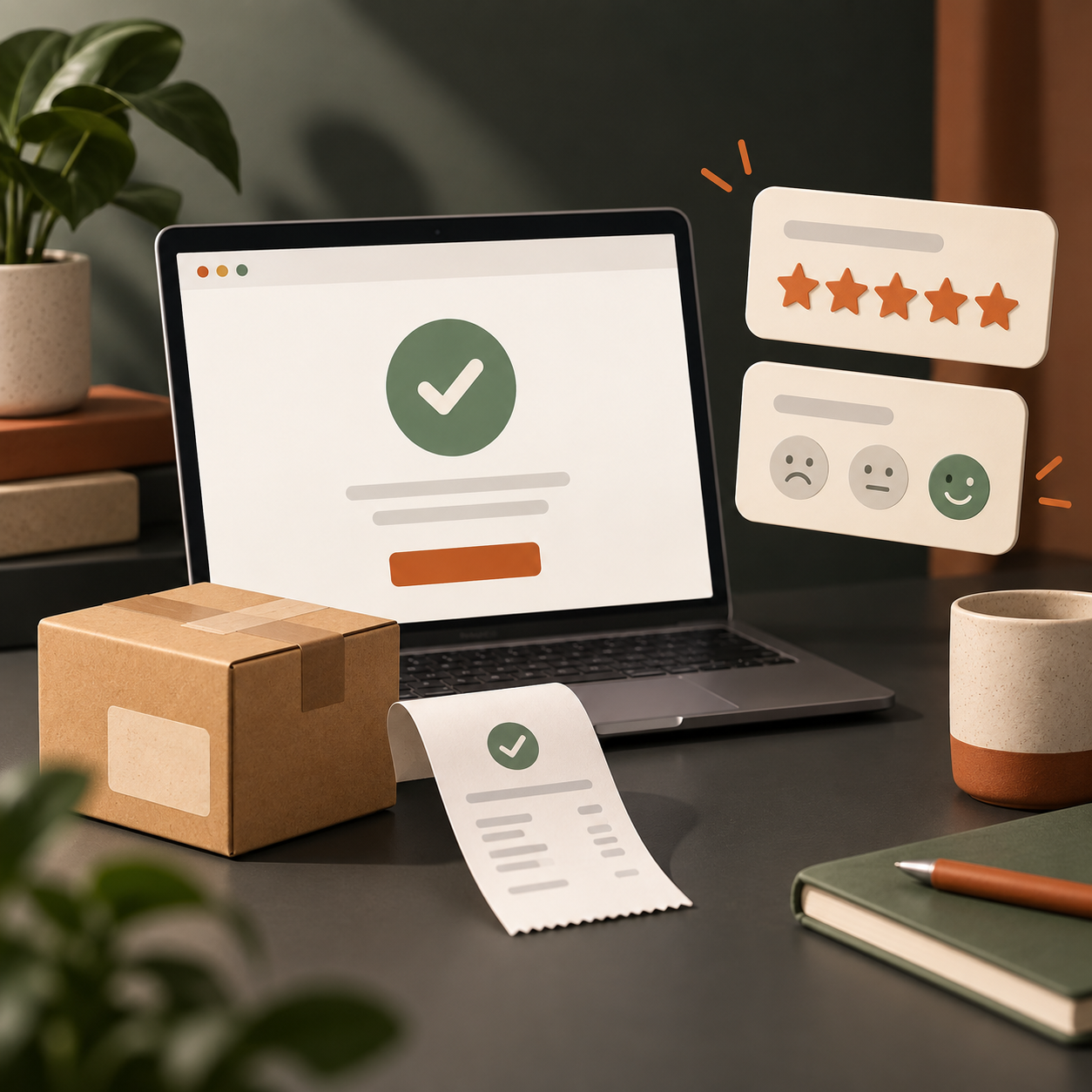
When to launch it
Show this immediately after a successful purchase, booking, or account upgrade—after the confirmation has done its job. A very short version can appear on the thank-you page; a more reflective follow-up can be sent one to three days later. This is the right survey when you want to understand why customers chose you and whether the journey felt reliable.
Questions to ask
- What was the main reason you decided to buy or book today?
- What almost stopped you from completing your purchase?
- Which part of the process felt easiest?
- Was there any information you looked for before buying but could not find?
What to do with the answers
Use the answers to identify the trust signals and messages that actually helped conversion: reviews, delivery information, a product comparison, a demo, or a clear refund policy. Preserve those strengths. Then map hesitation points to checkout steps, payment options, shipping details, or product-page content. Post-purchase feedback is particularly useful because customers completed the journey despite the friction—so it reveals what nearly became a lost sale.
4. Redesign research survey

When to launch it
Run this before a redesign brief is finalized, ideally with recent customers, qualified leads, and people who use the current site regularly. It should never be the only input to a redesign, but it is a fast way to uncover what must remain clear and what deserves attention before visual directions take over.
Questions to ask
- What do you use this website or product for most often?
- Which task takes more effort than it should?
- What information do you rely on but find difficult to locate?
- If one thing could be improved first, what would you choose?
- What should not change because it already works well?
What to do with the answers
Turn responses into a redesign evidence board. Mark patterns as “protect,” “clarify,” or “rework,” and connect each theme to a journey, page, or component. This keeps the project from replacing familiar, helpful parts of the experience just because they look old. The strongest findings should become acceptance criteria: for example, visitors should be able to locate pricing, understand the process, or find support without assistance.
5. Feature feedback survey
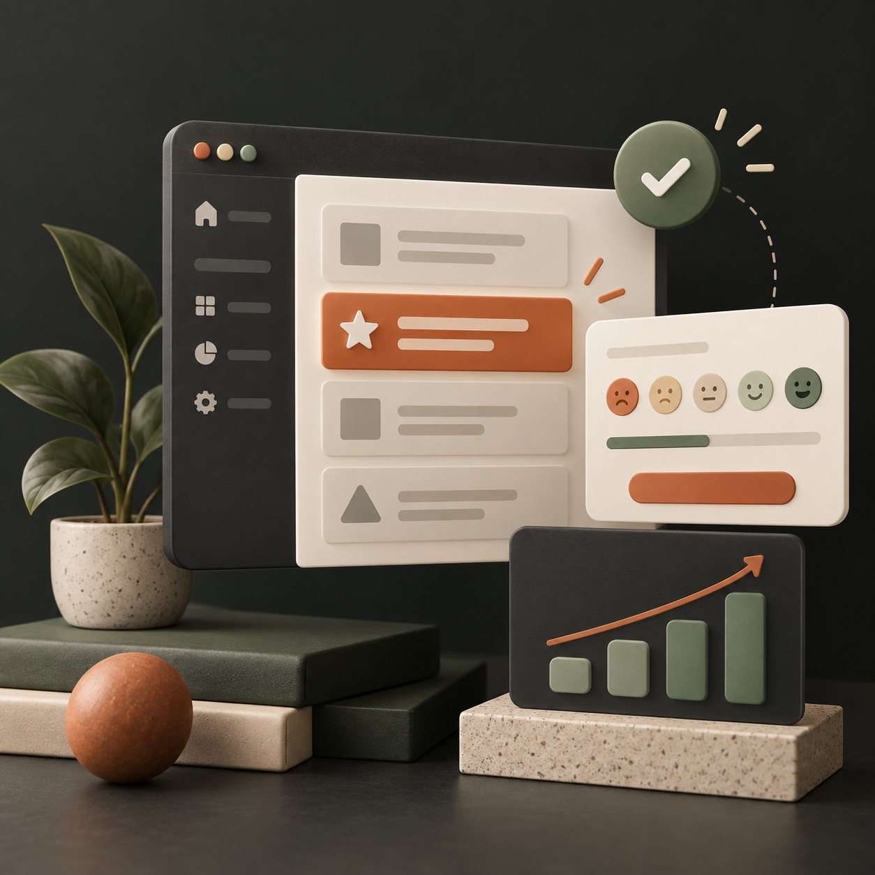
When to launch it
Launch after a user has actually interacted with a new or changed feature, not on first exposure. A good trigger could be completing a task, using a feature twice, or leaving the relevant screen. This survey is useful after a release, during a beta, or when usage data suggests people discover a feature but do not finish with it.
Questions to ask
- What were you trying to accomplish with this feature?
- Did the feature work the way you expected?
- What, if anything, was confusing?
- What would make this feature more useful in your work?
- How easy was it to complete your task?
What to do with the answers
Read feature feedback alongside behavioural data. Low task confidence plus a high drop-off at one step is a strong signal to inspect that step. Requests for a capability may reveal a discoverability problem rather than a missing feature; check whether people saw the existing option and understood its name. Prioritize changes that remove a repeated blocker for an important user task, then use a follow-up survey to validate the improvement.
A useful survey is small, specific and actionable
The best feedback survey does not try to measure the whole experience in one go. It asks a small number of people the right question at the right moment, then gives the team a clear place to investigate.
Survey Ninja gives us a practical way to run these lightweight studies. Combined with a review of the page or journey, the results help turn vague signals—“people are not converting” or “users do not get it”—into a focused next step.